Your cart is currently empty!
5 Christmas Color Scheme Ideas for 2026
Christmas doesn’t always have to mean bright red, forest green, and gold. This year, there’s room to be more creative with color.
The key is to pair a Christmas-associated color with something unexpected, creating a palette that feels festive without looking predictable. Some pairings lean crisp and contemporary, while others feel nostalgic, cozy, or storybook-inspired.
If you’re ready to break away from the ordinary and give your designs or holiday space a fresh look, here are five Christmas color schemes for 2026.
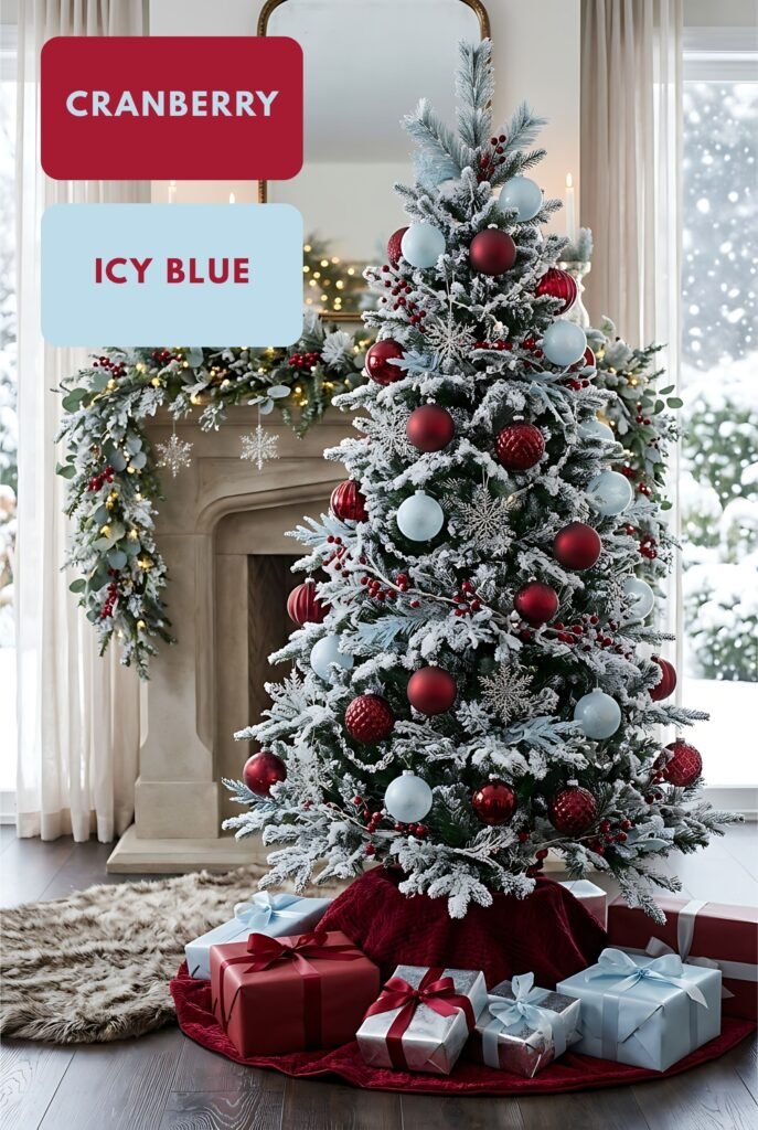
1. Cranberry + Icy Blue
This combination gives Christmas a cooler, more contemporary feeling. Deep cranberry supplies the warmth and festive weight, and icy blue adds a cool, frosted lightness that makes the whole design feel open and airy. The contrast between warm and cool is what makes it feel fresh instead of traditional.
The mood is calm, clean, and quietly elegant, like fresh snow on a bright morning. It suits people who love Christmas but find classic red and green too loud.
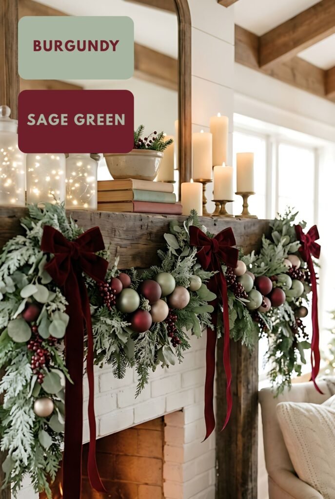
2. Sage Green + Burgundy
This is a softer interpretation of the classic green-and-red combination. Instead of bright Christmas green and scarlet, sage and burgundy create something muted, vintage, cozy, and sophisticated. It would work beautifully for cottagecore, farmhouse, botanical, rustic, and vintage Christmas designs.
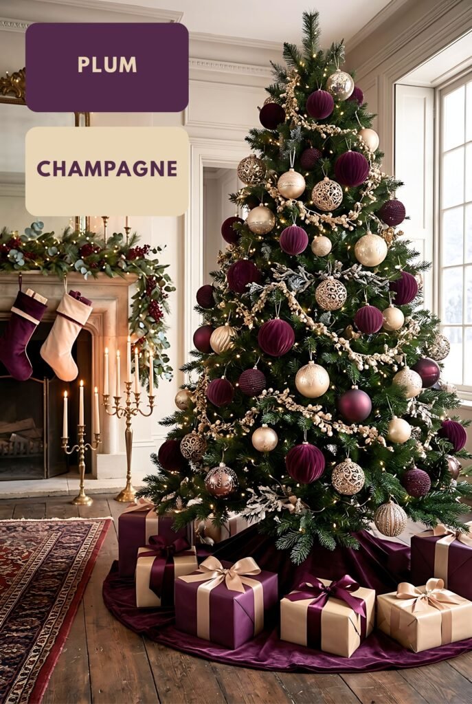
3. Plum + Champagne
If you’re looking for something more luxurious, plum and champagne make an elegant alternative to traditional red and gold. The deep purple gives the palette richness, while champagne adds warmth without the stronger yellow appearance of traditional gold.
The mood is polished, glamorous, and evening-ready, like candlelight, velvet, and a beautifully set table. It’s festive without being flashy, and it can look modern or classic depending on the styling.
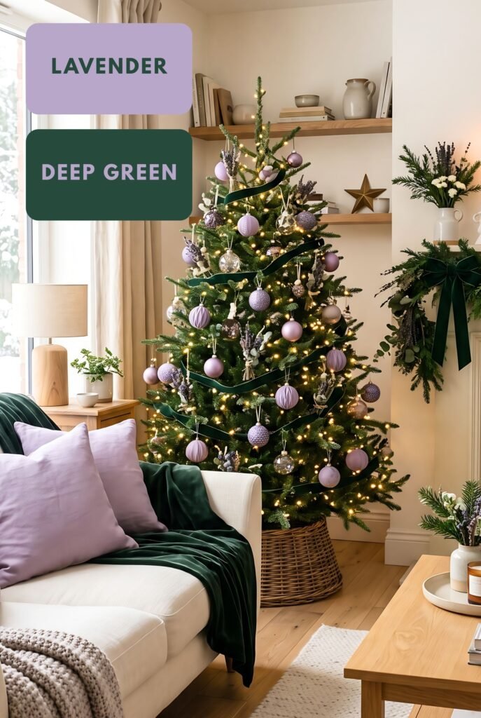
4. Lavender + Deep Green
Lavender isn’t an obvious Christmas color, which is exactly why this pairing can stand out. Combined with deep green, it creates a dreamy, whimsical winter palette that works particularly well for magical or fairytale-inspired Christmas designs.
It’s got a whimsical and enchanted vibe to it, like a twilight winter forest or the pages of a fairytale. It feels gentle and imaginative, with more of a storybook charm.
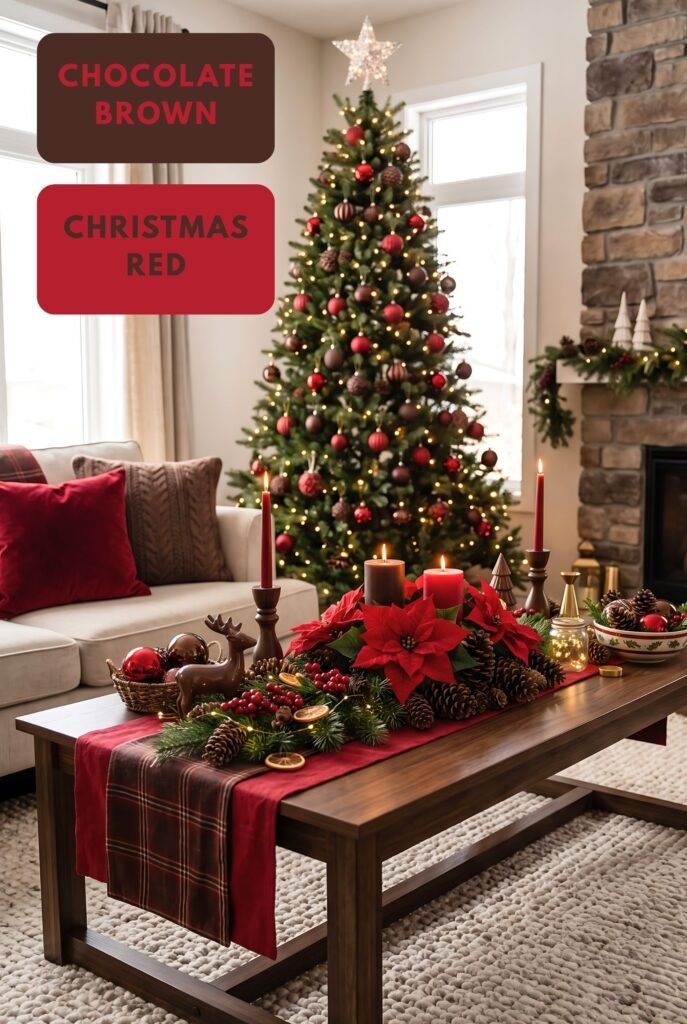
5. Chocolate Brown + Christmas Red
Chocolate brown creates a warm, old-fashioned Christmas confectionery aesthetic. Think gingerbread houses, cocoa, cinnamon, wooden ornaments, vintage candy shops, and Christmas markets.
It creates a sweet, cozy, and deeply nostalgic mood. It’s the most comforting palette here, and it suits designs meant to feel like childhood holidays and home baking.
Make Christmas Your Own
Christmas color has never had to follow a rulebook. These five palettes show how far a single unexpected pairing can go, from crisp and modern to cozy and nostalgic.
Pick the mood that feels most like your Christmas, and let it guide your next design or your holiday decor. Sometimes one fresh color combination is all it takes to make a season feel new.
These five color schemes are a great starting point, but the best decor is what feels right for your home.
I’d love to read your comments about what color combinations you are going for – or thinking of going for-this Christmas. Let me know your plans below!
Leave a Reply